.

Duro Estudio is an architecture studio focused on the design and development of spaces that integrate functionality, aesthetics, and construction quality. Its approach is rooted in understanding living spaces as a comprehensive experience, combining technical precision with a sensitive perspective to address real needs through a contemporary and long-term vision.
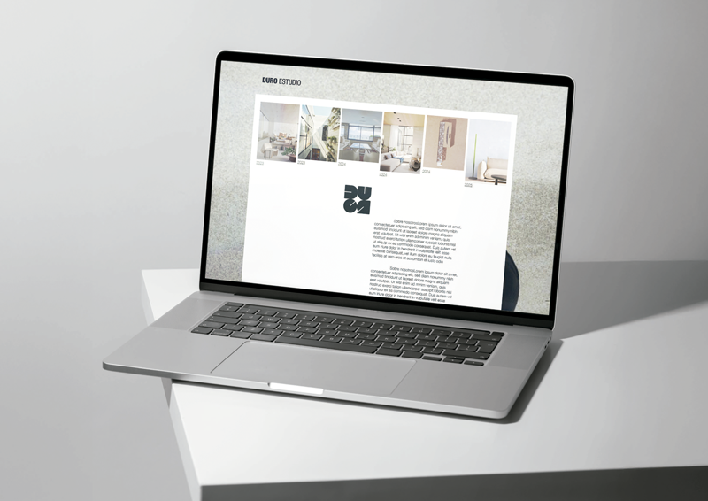
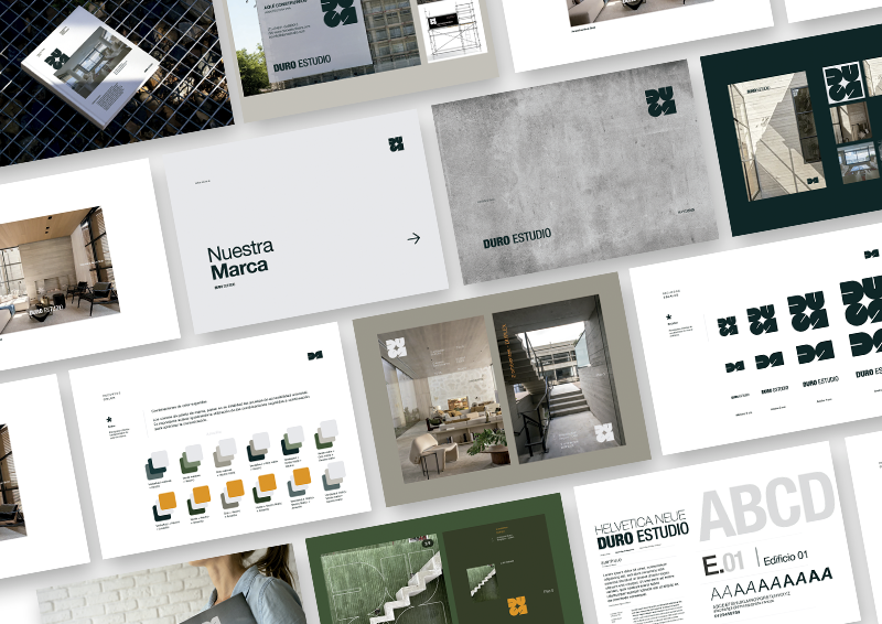
We developed the brand’s visual identity, creating a graphic system aligned with its positioning: solid, minimalist, and with a strong architectural character. The identity is built around an abstract symbol that acts as a distinctive element, paired with a bold typographic logo designed to work flexibly across different contexts and applications.
A typographic system based on Helvetica Neue was defined, along with a restrained color palette dominated by greens, grays, and neutral tones that reinforce the connection to materials and construction. Clear guidelines for usage, scalability, color combinations, and applications were also established, ensuring consistency across all brand touchpoints.

The result is a consistent and recognizable visual identity that clearly communicates the studio’s values and architectural approach.
The developed system allows the brand to be applied coherently across multiple formats and contexts, maintaining a refined and professional aesthetic while establishing a solid foundation for the future evolution of its communication.